Back in 2014, Google introduced its Material design language in Android 5.0 Lollipop. This language has since evolved a great deal to make personalization better for Android users. However, in recent years, Google has taken a shift towards a more steady design. In its recent I/O, Google rolled out an updated version of Material design known as Material You.

Material You is the latest and updated variant of the preceding Material Design and mainly focuses on customization aspects. The updated design language will first be coming to Google applications and Pixel phones. The design will then be rolled out into Wear OS and various other platforms as per the plan.
The main priority of this new design language is to make the most of all available screen space with the option to choose from different color palettes created by Google itself. With a combination of the latest interface elements from the preceding Material Design and the color option, the company tends to bring missing colors until now.

With a basic knowledge of Material You, design language keeps reading further to know what this new language offers.
Customization and Personalization with Material You
Over the years, there have been many operating systems with customization features. The most well-known of all might be the original Macintosh that allowed users to choose from a collection of different wallpapers and fonts. Even the initial versions of Windows allowed users to select different colors for a different user interface element.
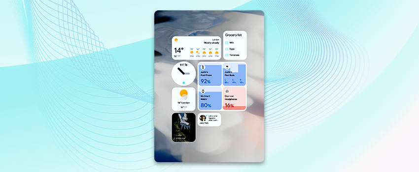
Material You distinguishes from both Windows and Mac because it offers Android users a subtle interface. However, there is no denying that Material You was designed to make the interface feel more lively. A few such noticeable changes include the sluggish movement of widgets, a little bounce after reaching the end of a list, and the shimmering of the entire screen after unlocking or charging the phone.
Over the years, Google has become very flexible. For example, it is evident in the UI of Material You where the UI elements are no longer stagnant images; instead, they are upon alterable parameters. In addition, the expression engine used in Android 12 is capable of updating different parts of the interface in real-time.
User Interface that represents the user
The primary intent behind the designing of Material You is to create an accessible solution that perfectly fits everyone irrespective of whether the user is visually impaired or an active user who customizes everything to suit their requirements. Material You empowers the user with the liberty to customize the fonts and buttons whichever way is required.
The most distinctive aspect of Material You is the color palette configuration. The idea of building the color scheme of the phone from the wallpaper is undoubtedly remarkable. The reason behind this is that, as per Google, nobody hardly alters the default of the software. Still, most people modify their wallpapers with images or quotes that better represent the nature of the user.
The customization elements will undoubtedly result in unique interfaces for everyone. However, to ensure that the interface design does not clash with Google hardware, the software selects color palettes shaped in coordination with the industrial design team of Google.
Improved functions and features in the Material You design
The Material You design language used in the latest Android 12 has many new and enhanced features worth exploring further. Let us take a look at these note-worthy enhancements:
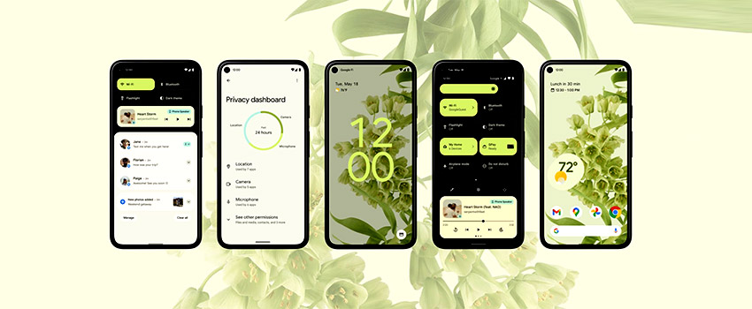
Privacy Dashboard:
For starters, let us talk about the new privacy dashboard that comes with the Android 12, and this dashboard is mainly dedicated to camera, permissions, location, and mic usages. A unique feature of this dashboard is that one can access a detailed timeline of the permissions used by different applications in the last 24 hours.
Light Indicator:
The next best thing about Material You is implementing the green dot on the status bar. It is about time that Android phones are equipped with an indicator whose job is to inform the user whenever an app uses the camera or mic of the phone. The quick setting panel of Android 12 features two new toggles for these sensors. These toggles are used to enable or disable the system-wide access in an instant.
Approximate Location:
With the introduction of the new approximate location feature, the Material You design now empowers Android users to limit the data shared through the phone. Android users can now configure settings that allow weather apps to use an approximate location, whereas food delivery and cab booking applications can be configured to use precise locations.
Android Private Compute Core:
The Android Private Compute Core is another feature to protect Android users’ privacy. To ensure enhanced privacy, language and audio processing features such as Smart Reply and Live Caption can be performed on the device locally. Google further emphasizes that the protection features of the Private Computer Core are open-source, enabling the security community to inspect and verify accountability of these features.
Quick Delete:
Android 12 is equipped with a Quick Delete feature that allows Android users to delete the last fifteen minutes of the Google Search history instantly. The Quick Delete feature is available on the Google Account menu and requires just a simple tap to delete the recent search history.
Locked Folder for Google Photos:
The locked folder helps store private and vital images and restricts access to them with a pin, password, or fingerprint. The images stored in the locked folder will never show up in other places of the photo app. In addition, various other feature improvements have been embedded into the app, such as better control over memories, smarter photo grids, and cinematic moments.
Enhanced Accessibility:
Android 12 is equipped with various new accessibility features such as unlocking cars with NFC, better support for other third-party app stores, a built-in remote to control Chromecast with Google and Android TVs, along with enhanced ChromeOS integration with Wi-Fi Direct photo sharing.
Google Maps:
The updated version of Google Maps on Android 12 comes with a new routing system that can help Android users detect and avoid roads with heavy traffic and suitable points of interest based on the time of the day. Furthermore, by the end of this year, the app will have access to detailed street maps of more than fifty cities. This highly accurate data can show the width of the sidewalks, roads, urban trails, and crosswalks, along with the information if a specific area is stroller or wheelchair friendly.
Conclusion
It is happening for the first time that designers at Google are sharing the control of every pixel with the users. The Material You design paired with Android 12 gives Android devices a unified look like never before. It is very likely that most of the apps and products offered by Google in the near future will be updated with different elements of this design language. Many mobile app development companies and Android app development services seem to be on board and excited about features and tweaks in the latest Material You design language.
Related Articles
-
Android O to Take Precedence with Enhanced Features
An analytical company named StatCounter recently presented a report in which they have an analyzed worldwide Operating system market share. It has stated that Google’s Android has overtaken Microsoft Windows
-
Business Benefits of Android Application Development
Android application development is a field that has evolved over the years and today the Android store has over a million apps already. There are a plethora of Android apps
-
Top 20 Android App Development Trends in 2021 that Shouldn’t be Missed
Android apps have become an indispensable part of our daily lives. As a result of the COVID-19 pandemic, there was a significant increase in demand for specific app categories. Users

