Shopify is a unique platform known for its innovative approach to helping business owners worldwide. In 2017, the platform introduced us to Polaris, a design system that simplifies UI for Shopify partners.
The platform was launched with an approach to revolutionizing UI: launching UI Kits, which enable developers to create a smoother sales process for merchants.
This blog examines the different aspects of building an app with Shopify Polaris. In the following sections, we will learn more about the platform and how to leverage it for app development.
What is Shopify Polaris? What is it About?
The Shopify Polaris design system demonstrates that Shopify remains loyal to its aim of improving commerce for everyone. Shopify emphasized the importance of its goods being usable, helpful to all users, and consistent across all contact points.
You may ask why Shopify would go into establishing and maintaining Polaris for developers.
The solution is straightforward: uniformity, efficiency, and improved user experience. Shopify guarantees that all applications and interfaces look and feel consistent by using a uniform design language and shared components. This benefits end users and simplifies your job as a developer.
The ultimate objective was to guarantee that all Shopify goods followed the same design concepts and language. To accomplish this, an in-depth design system was required. Design systems alter and evolve, but we can confidently state that the Polaris system is an excellent starting point.

3 Shopify Polaris Components that Make App Building Effortless
Components
Shopify provides many pre-built UI components that you can integrate straight into your applications. Polaris includes layout components to help you standardize the design of your pages, as well as common form inputs and action buttons that handle the vast majority of user interactions.
These Shopify UI components are intended to be versatile and configurable, allowing you to tailor them to your exact requirements while retaining a consistent appearance and feel.
Accessibility & Internationalization Coverage
The bundled components offer capabilities such as built-in ARIA characteristics, making them simple to use with keyboards and screen readers. They also include useful recommendations to help you meet accessibility requirements, which include anything from color contrast to attention management.
Regarding internationalization, Shopify continues to help us manage numerous languages and currencies, just as they do with storefront support.
Icons & Tokens
Polaris’ iconography and token system give our app a distinct Shopify flavor. The token system is a set of variables that Shopify employs to standardize elements like color, font, and space. Combining these tokens with the icon collection will provide an app’s final degree of finish, giving it a professional Shopify touch to the finished product.
This seamless connection ensures that your app blends well with the Shopify platform, providing users a smooth, coherent experience. Using these tools saves you time and ensures your app appears professional and on-brand, as Shopify intended.
Now that you know Shopify Polaris components, let’s learn more about the steps in building apps in the following sections.
Building with Shopify Polaris: Your DIY
1. Set Up Your Development Environment
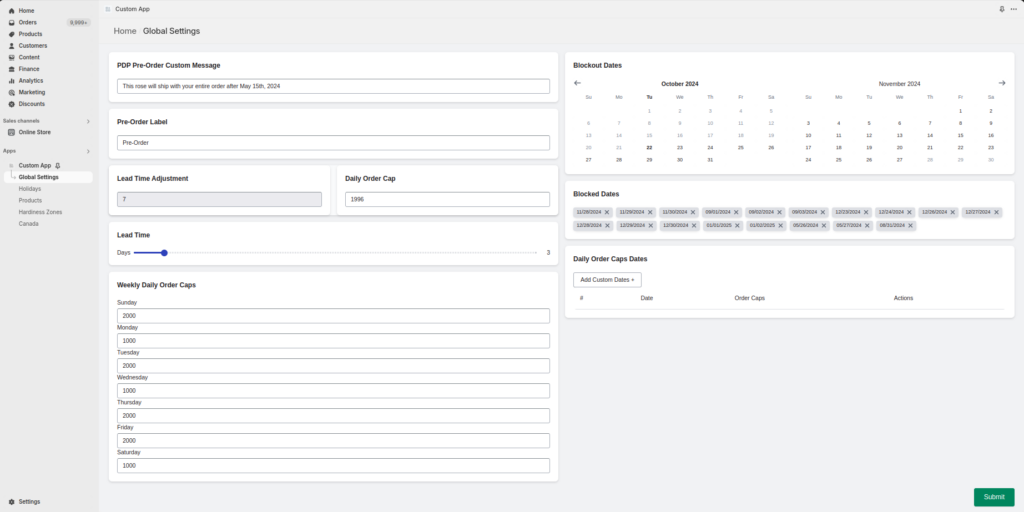
Before building apps with Polaris, you must configure your development environment.
- Install Node.js and npm: Polaris requires Node.js for app development. Install the latest stable Node.js and npm (Node Package Manager).
- Install Shopify CLI: Shopify Command Line Interface (CLI) helps plan your app and set up development configurations. You can install Shopify CLI using npm by running the following command:
- Install Polaris React Components: Polaris is available as a React component library. This command adds Polaris to your app’s dependencies, making its components available in your React-based Shopify app.
2. Scaffold a Shopify App
Once your environment is set up, the next step is to prepare a Shopify app using Shopify CLI.
Create a New Shopify App: Run the following command to scaffold a new app:
“bash
Shopify app creates node”
This creates the basic file structure, including a ‘server.js’ file to handle the backend logic and a ‘pages’ directory for front-end pages.
Install App Dependencies: Navigate into your app’s directory and install the necessary dependencies, including React:
This installs packages like ‘react,’ ‘react-dom,’ ‘next,’ and other aspects needed for app development.
3. Familiarize Yourself with Polaris Components
Polaris provides a range of pre-built components designed to maintain consistency with Shopify’s design system. Before building, familiarize yourself with the core Polaris components.
- Typography: Polaris provides standardized text components like ‘DisplayText,’ ‘Heading,’ and ‘TextStyle.’ Use these to ensure your app’s typography aligns with Shopify’s guidelines.
- Forms: Polaris has form components like ‘TextField,’ ‘Checkbox,’ and ‘Select’ for creating user-friendly forms.
- Layout and Structure: Components like ‘Page,’ ‘Card,’ and ‘Layout’ help create structured, responsive interfaces.
- Feedback and Actions: For user interaction, Polaris includes components such as ‘Button,’ ‘Toast,’ ‘Modal,’ and ‘Banner.’
4. Create the App Layout
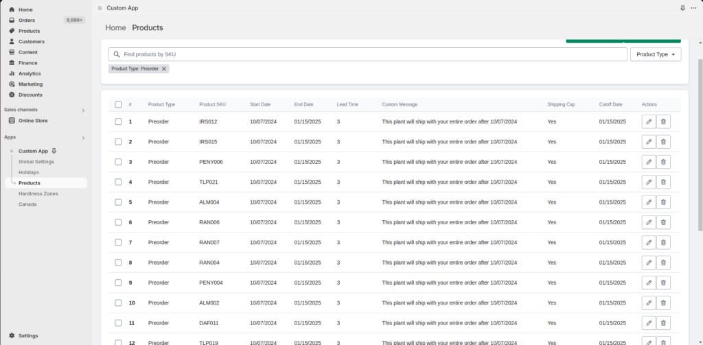
Start by setting up the basic layout of your app using Polaris components.
- Use the “AppProvider” Component: Polaris components rely on the AppProvider component to work correctly. Wrap your app in this component to provide the required context.
- Page and Layout Components: Use Polaris ‘Page’ and ‘Layout’ components to structure your app’s content. This ensures your app’s layout is consistent with Shopify’s UI patterns.
5. Design Forms and User Inputs
Many Shopify apps require form inputs, and Polaris provides components that ensure accessibility and usability.
- Use ‘Form’ and ‘TextField’: Build your app’s forms using Polaris’s ‘Form,’ ‘TextField,’ and other input components.
“jsx
import {Form, TextField, Button} from ‘@shopify/polaris’;
import {useState} from ‘react’;
function ProductForm() {
const [productName, setProductName] = useState(”);
return (
<Form onSubmit={() => console.log(productName)}>
<TextField
label=”Product Name”
value={productName}
onChange={(value) => setProductName(value)}
/>
<Button submit>Submit</Button>
</Form>
);
}”
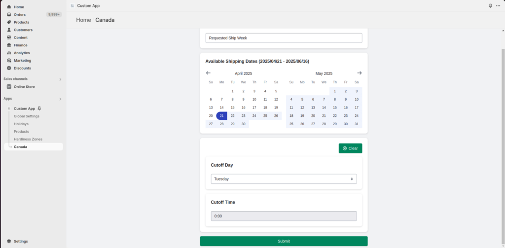
Polaris provides components to manage app navigation.
- Use ‘Navigation’ Component: The ‘Navigation’ component lets you build a sidebar that aligns with Shopify’s navigation standards.
“jsx
import {Navigation} from ‘@shopify/polaris’;
import {HomeMajor, OrdersMajor} from ‘@shopify/polaris-icons’;
function AppNavigation() {
return (
<Navigation location=”/”>
<Navigation.Section
items={[
{
label: ‘Home’,
icon: HomeMajor,
url: ‘/’,
},
{
label: ‘Orders’,
icon: OrdersMajor,
url: ‘/orders’,
},
]}
/>
</Navigation>
);
}“
Finally, when building Shopify apps, Next.js is often used for routing. Use “Link” from Next.js to handle navigation between pages.
7. Add Error Handling and Feedback
To enhance user experience, handle errors, and provide feedback using Polaris feedback components when necessary.
- Use the ‘Banner’ Component: Show error or success messages using the ‘Banner’ component.
- Use ‘Toast’ for Notifications: ‘Toast’ to show brief notifications for actions like form submissions.
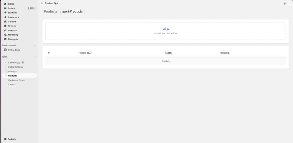
8. Test Your App
Before finalizing your app, test it thoroughly to ensure it works correctly across different environments.
Use the Shopify CLI’s Dev Mode: The Shopify CLI offers a “Shopify app serve” command, which launches your app in development mode. This lets you see changes in real time and debug any issues.
Perform UI Testing: Check your app’s UI across various screen sizes and browsers to ensure it looks correct.
9. Deploy the App
Once your app is ready, it will be deployed to Shopify merchants.
- Prepare for Production: Shopify Power BI connector can help to monitor your app performance accurately, providing custom data visualisation.
- Submit to Shopify App Store: If you want your app to be available on the Shopify App Store, you’ll need to submit it for review through your Shopify Partner Dashboard.
[ Read More: Your Shopify Analytics Roadmap to eCommerce Business Growth ]
Advantages of the Shopify Polaris App
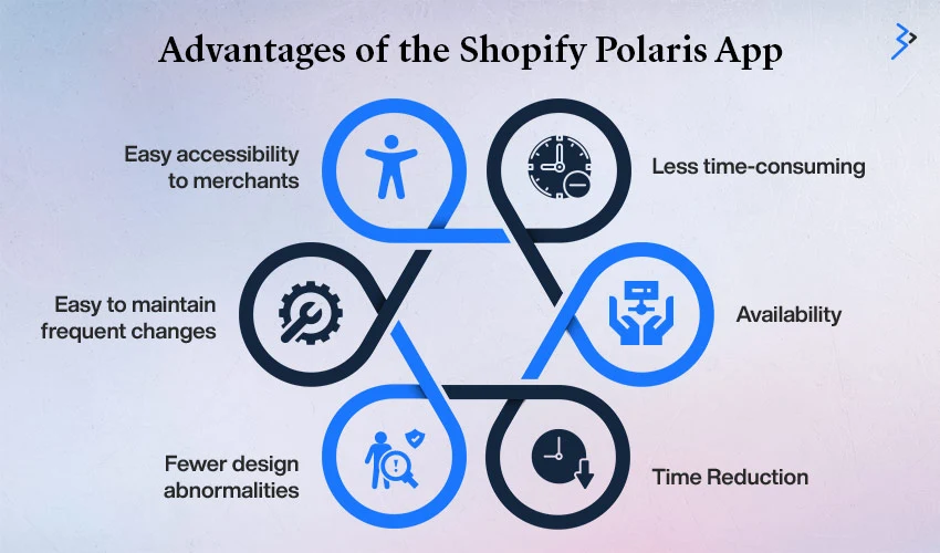
Every design system has advantages, and Shopify Polaris significantly benefits merchants and developers.
- Less time-consuming:
Polaris is a design system, so the ingredients, utensils, and recipes are already laid out for you; all you have to do now is start cooking.
- Availability:
Availability of pre-written components that adhere to Shopify’s UI component
- Time Reduction:
Pre-written components save time and effort when designing and creating components and help maintain consistency.
- Low probability of bugs in design or design abnormalities:
Shopify’s design system currently provides components that meet the design requirements of the Shopify platform app. Design systems enable teams to utilize the same parts again, avoiding the need to reinvent the wheel and thereby creating unintentional inconsistency.
- Easy to maintain frequent changes
Shopify always provides resources when it releases new upgrades. In a consistent design system, adding modifications will become easier since they will not break the existing code structure.
- Easy accessibility to merchants
Aside from the consistency of the entire user experience, the finest feature is that merchants do not need to leave Shopify’s admin. They can access the applications and configure features from within the admin. This helps you focus on the work at hand. Polaris makes it easy for merchants to transition between applications.
Conclusion
Building a Shopify app has become effortless with Polaris. However, given the different aspects of the development procedure, many business owners tend to deviate from their operations.
Therefore, it’s best to trust a professional Shopify app development service for your business in such instances. These experts are professional Shopify partners who help you build the app effortlessly and boost your operations in no time.
Wait no more; connect with your premier Shopify app development company today!
Related Articles
-
The Ultimate Guide to Optimizing Your Shopify eCommerce Store for Conversions
This guide aims to help Shopify eCommerce stores become conversion powerhouses by navigating Shopify’s ecosystem, exploring customer journeys, and utilizing tools for Conversion Rate Optimization (CRO). It covers building a
-
9 Proven Strategies To Build eCommerce Customer Loyalty
What if our experts could boost 67% of your current sales and reduce 80% of your marketing budget? This may appear like a dream and a distant goal, but we
-
Migrate Your eCommerce store to Shopify Plus
Why Your eCommerce Store Needs to Migrate Your online store is a statement to the world. It defines your aesthetic, values, and customer-centric approach that helps people purchase. Just like

